
- Introduction
- Creating new widget definition
- Integrating existing code to create widget definition
- Widget code debugging tips
- Next steps
Introduction
IoT Hub widgets are additional UI modules that easily integrate into any IoT Dashboard. They provide end-user functions such as data visualization, remote device control, alarms management and display of static custom html content. According to the provided features, each widget definition represents a specific Widget Type.
Creating new widget definition
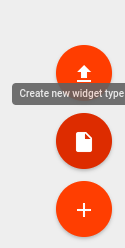
In order to create a new widget definition, navigate to “Widget Library” and open existing “Widgets Bundle” or create a new one. In the “Widgets Bundle” view, click the big “+” button at the bottom-right part of the screen and then click the “Create new widget type” button.
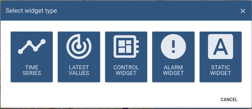
“Select widget type” window should appear with select options corresponding to the widget type you intend to develop.
After that, the pre-populated “Widget Editor” page will open with starter widget template according to previously selected widget type.
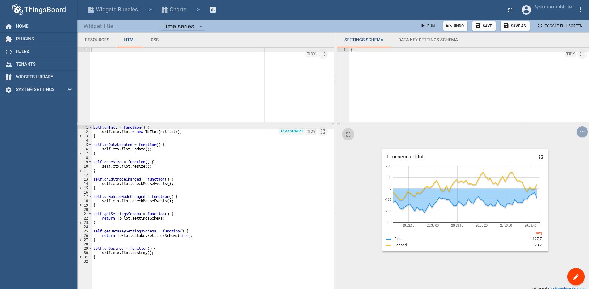
Widget Editor overview
Widget Editor view is a mini IDE designed to develop custom widget definitions. It consists of top toolbar and four main sections:
Widget Editor Toolbar

Widget Editor Toolbar consists of the following items:
- Widget Title field - used to specify title of the widget definition
- Widget Type selector - used to specify type of the widget definition
- Run button - used to run widget code and view result in Widget preview section
- Undo button - reverts all editor sections to latest saved state
- Save button - saves widget definition
- Save as button - allows to save a new copy of widget definition by specifying new widget type name and target Widgets Bundle
Resources/HTML/CSS section
This section consists of three tabs:
The first Resources tab is used to specify external JavaScript/CSS resources used by the widget.
Second HTML tab contains widget html code (Note: some widgets create html content dynamically, thus their initial html content can be empty).
Third CSS tab contains widget specific CSS style definitions.
JavaScript section
This section contains all widget related JavaScript code according to the Widget API.
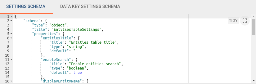
Settings schema section
This section consists of two tabs:
The first tab, Settings schema, is used to specify the json schema of widget settings for UI form auto-generation using react-schema-form builder. This generated UI form is displayed in the Advanced tab of widget settings. The Settings Object serialized by this schema is used to store specific widget settings and is accessible from widget JavaScript code.
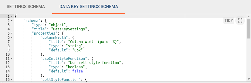
The second tab, Data key settings schema, is used to specify json schema of data key settings for UI form auto-generation using react-schema-form builder. This generated UI form is displayed in Advanced tab of the Data key configuration dialog. The Settings Object serialized by this schema is used to store specific settings for each data key of the datasource defined in the widget. These settings are accessible from widget JavaScript code.
Widget preview section
This section is used to preview and test widget definitions. It is presented as a mini dashboard containing one widget instantiated from the current widget definition. It has mostly all functionality provided by usual IoT Hub dashboard, with some limitations. For example, “Function” can only be selected as datasource type in widget datasources section for debugging purposes.
Basic widget API
All widget related code is located in the JavaScript section. The built-in variable self that is a reference to the widget instance is also available. Each widget function should be defined as a property of the self variable. self variable has property ctx of type WidgetContext - a reference to widget context that has all necessary API and data used by widget instance. Below is brief description of widget context properties:
| Property | Type | Description |
|---|---|---|
| $container | jQuery Object | Container element of the widget. Can be used to dynamically access or modify widget DOM using jQuery API. |
| $scope | IDynamicWidgetComponent | Reference to the current widget component. Can be used to access/modify component properties when widget is built using Angular approach. |
| width | Number | Current width of widget container in pixels. |
| height | Number | Current height of widget container in pixels. |
| isEdit | Boolean | Indicates whether the dashboard is in in the view or editing state. |
| isMobile | Boolean | Indicates whether the dashboard view is less then 960px width (default mobile breakpoint). |
| widgetConfig | WidgetConfig | Common widget configuration containing properties such as color (text color), backgroundColor (widget background color), etc. |
| settings | Object | Widget settings containing widget specific properties according to the defined settings json schema |
| datasources | Array<Datasource> | Array of resolved widget datasources. See Subscription object. |
| data | Array<DatasourceData> | Array of latest datasources data. See Subscription object. |
| timeWindow | WidgetTimewindow | Current widget timewindow (applicable for timeseries widgets). Holds information about current timewindow bounds. minTime - minimum time in UTC milliseconds, maxTime - maximum time in UTC milliseconds, interval - current aggregation interval in milliseconds. |
| units | String | Optional property defining units text of values displayed by widget. Useful for simple widgets like cards or gauges. |
| decimals | Number | Optional property defining how many positions should be used to display decimal part of the value number. |
| hideTitlePanel | Boolean | Manages visibility of widget title panel. Useful for widget with custom title panels or different states. updateWidgetParams() function must be called after this property change. |
| widgetTitle | String | If set, will override configured widget title text. updateWidgetParams() function must be called after this property change. |
| detectChanges() | Function | Trigger change detection for current widget. Must be invoked when widget HTML template bindings should be updated due to widget data changes. |
| updateWidgetParams() | Function | Updates widget with runtime set properties such as widgetTitle, hideTitlePanel, etc. Must be invoked in order these properties changes take effect. |
| defaultSubscription | IWidgetSubscription | Default widget subscription object contains all subscription information, including current data, according to the widget type. See Subscription object. |
| timewindowFunctions | TimewindowFunctions | Object with timewindow functions used to manage widget data time frame. Can by used by Time-series or Alarm widgets. See Timewindow functions. |
| controlApi | RpcApi | Object that provides API functions for RPC (Control) widgets. See Control API. |
| actionsApi | WidgetActionsApi | Set of API functions to work with user defined actions. See Actions API. |
| stateController | IStateController | Reference to Dashboard state controller, providing API to manage current dashboard state. See State Controller. |
In order to implement a new widget, the following JavaScript functions should be defined (Note: each function is optional and can be implemented according to widget specific behaviour):
| Function | Description | |
|---|---|---|
onInit() |
The first function which is called when widget is ready for initialization. Should be used to prepare widget DOM, process widget settings and initial subscription information. | |
onDataUpdated() |
Called when the new data is available from the widget subscription. Latest data can be accessed from the defaultSubscription object of widget context (ctx). | |
onResize() |
Called when widget container is resized. Latest width and height can be obtained from widget context (ctx). | |
onEditModeChanged() |
Called when dashboard editing mode is changed. Latest mode is handled by isEdit property of ctx. | |
onMobileModeChanged() |
Called when dashboard view width crosses mobile breakpoint. Latest state is handled by isMobile property of ctx. | |
onDestroy() |
Called when widget element is destroyed. Should be used to cleanup all resources if necessary. | |
getSettingsSchema() |
Optional function returning widget settings schema json as alternative to Settings tab of Settings schema section. | |
getDataKeySettingsSchema() |
Optional function returning particular data key settings schema json as alternative to Data key settings schema tab of Settings schema section. | |
typeParameters() |
Returns WidgetTypeParameters object describing widget datasource parameters. See Type parameters object. | |
actionSources() |
Returns map describing available widget action sources (WidgetActionSource) used to define user actions. See Action sources object. |
Subscription object
The widget subscription object is instance of IWidgetSubscription and contains all subscription information, including current data, according to the widget type. Depending on widget type, subscription object provides different data structures. For Latest values and Time-series widget types, it provides the following properties:
- datasources - array of datasources (Array<Datasource>) used by this subscription, using the following structure:
1
2
3
4
5
6
7
8
9
10
11
12
13
14
15
16
17
18
19
20
21
22
    datasources = [
        {  // datasource
           type: 'entity',// type of the datasource. Can be "function" or "entity"
           name: 'name', // name of the datasource (in case of "entity" usually Entity name)
           aliasName: 'aliasName', // name of the alias used to resolve this particular datasource Entity
           entityName: 'entityName', // name of the Entity used as datasource
           entityType: 'DEVICE', // datasource Entity type (for ex. "DEVICE", "ASSET", "TENANT", etc.)
           entityId: '943b8cd0-576a-11e7-824c-0b1cb331ec92', // entity identificator presented as string uuid.
           dataKeys: [ //  array of keys (Array<DataKey>) (attributes or timeseries) of the entity used to fetch data
               { // dataKey
                    name: 'name', // the name of the particular entity attribute/timeseries
                    type: 'timeseries', // type of the dataKey. Can be "timeseries", "attribute" or "function"
                    label: 'Sin', // label of the dataKey. Used as display value (for ex. in the widget legend section)
                    color: '#ffffff', // color of the key. Can be used by widget to set color of the key data (for ex. lines in line chart or segments in the pie chart).
                    funcBody: "", // only applicable for datasource with type "function" and "function" key type. Defines body of the function to generate simulated data.
                    settings: {} // dataKey specific settings with structure according to the defined Data key settings json schema. See "Settings schema section".
               },
               //...
           ]
        },
        //...
    ]
- data - array of latest data (Array<DatasourceData>) received in scope of this subscription, using the following structure:
1
2
3
4
5
6
7
8
9
10
11
12
13
14
    data = [
        {
            datasource: {}, // datasource object of this data. See datasource structure above.
            dataKey: {}, // dataKey for which the data is held. See dataKey structure above.
            data: [ // array of data points
                [   // data point
                    1498150092317, // unix timestamp of datapoint in milliseconds
                    1, // value, can be either string, numeric or boolean
                ],
                //...
            ]
        },
        //...
    ]
For Alarm widget type it provides the following properties:
- alarmSource - (Datasource) information about entity for which alarms are fetched, using the following structure:
1
2
3
4
5
6
7
8
9
10
11
12
13
14
15
16
17
18
    alarmSource = {
         type: 'entity',// type of the alarm source. Can be "function" or "entity"
         name: 'name', // name of the alarm source (in case of "entity" usually Entity name)
         aliasName: 'aliasName', // name of the alias used to resolve this particular alarm source Entity
         entityName: 'entityName', // name of the Entity used as alarm source
         entityType: 'DEVICE', // alarm source Entity type (for ex. "DEVICE", "ASSET", "TENANT", etc.)
         entityId: '943b8cd0-576a-11e7-824c-0b1cb331ec92', // entity identificator presented as string uuid.
         dataKeys: [ // array of keys indicating alarm fields used to display alarms data
            { // dataKey
                 name: 'name', // the name of the particular alarm field
                 type: 'alarm', // type of the dataKey. Only "alarm" in this case.
                 label: 'Severity', // label of the dataKey. Used as display value (for ex. as a column title in the Alarms table)
                 color: '#ffffff', // color of the key. Can be used by widget to set color of the key data.
                 settings: {} // dataKey specific settings with structure according to the defined Data key settings json schema. See "Settings schema section".
            },
            //...
          ]
    }
- alarms - array of alarms (Array<Alarm>) received in scope of this subscription, using the following structure:
1
2
3
4
5
6
7
8
9
10
11
12
13
14
15
16
17
18
19
20
21
22
23
24
25
26
    alarms = [
        { // alarm
            id: { // alarm id
                entityType: "ALARM",
                id: "943b8cd0-576a-11e7-824c-0b1cb331ec92"
            },
            createdTime: 1498150092317, // Alarm created time (unix timestamp)
            startTs: 1498150092316, // Alarm started time (unix timestamp)
            endTs: 1498563899065, // Alarm end time (unix timestamp)
            ackTs: 0, // Time of alarm acknowledgment (unix timestamp)
            clearTs: 0, // Time of alarm clear (unix timestamp)
            originator: { // Originator - id of entity produced this alarm
                entityType: "ASSET",
                id: "ceb16a30-4142-11e7-8b30-d5d66714ea5a"
            },
            originatorName: "Originator Name", // Name of originator entity
            type: "Temperature", // Type of the alarm
            severity: "CRITICAL", // Severity of the alarm ("CRITICAL", "MAJOR", "MINOR", "WARNING", "INDETERMINATE")
            status: "ACTIVE_UNACK", // Status of the alarm
                                    // ("ACTIVE_UNACK" - active unacknowledged,
                                    // "ACTIVE_ACK" - active acknowledged,
                                    // "CLEARED_UNACK" - cleared unacknowledged,
                                    // "CLEARED_ACK" - cleared acknowledged)
            details: {} // Alarm details object derived from alarm details json.
        }
    ]
For RPC or Static widget types, subscription object is optional and does not contain necessary information.
Timewindow functions
Object with timewindow functions (TimewindowFunctions) used to manage widget data time frame. Can by used by Time-series or Alarm widgets.
| Function | Description |
|---|---|
onUpdateTimewindow(startTimeMs, endTimeMs) |
This function can be used to update current subscription time frame to historical one identified by startTimeMs and endTimeMs arguments. |
onResetTimewindow() |
Resets subscription time frame to default defined by widget timewindow component or dashboard timewindow depending on widget settings. |
Control API
Object that provides API functions (RpcApi) for RPC (Control) widgets.
| Function | Description |
|---|---|
sendOneWayCommand(method, params, timeout) |
Sends one way (without response) RPC command to the device. Returns command execution promise. method - RPC method name, string, params - RPC method params, custom json object, timeout - maximum delay in milliseconds to wait until response/acknowledgement is received. |
sendTwoWayCommand(method, params, timeout) |
Sends two way (with response) RPC command to the device. Returns command execution promise with response body in success callback. |
Actions API
Set of API functions (WidgetActionsApi) to work with user defined actions.
| Function | Description |
|---|---|
getActionDescriptors(actionSourceId) |
Returns the list of action descriptors for provided actionSourceId |
handleWidgetAction($event, descriptor, entityId, entityName) |
Handles action produced by particular action source. $event - event object associated with action, descriptor - action descriptor, entityId and entityName - current entity id and name provided by action source if available. |
State Controller
Reference to Dashboard state controller (IStateController), providing API to manage current dashboard state.
| Function | Description |
|---|---|
openState(id, params, openRightLayout) |
Navigates to new dashboard state. id - id of the target dashboard state, params - object with state parameters to use by the new state, openRightLayout - optional boolean argument to force open right dashboard layout if present in mobile view mode. |
updateState(id, params, openRightLayout) |
Updates current dashboard state. id - optional id of the target dashboard state to replace current state id, params - object with state parameters to update current state parameters, openRightLayout - optional boolean argument to force open right dashboard layout if present in mobile view mode. |
getStateId() |
Returns current dashboard state id. |
getStateParams() |
Returns current dashboard state parameters. |
getStateParamsByStateId(id) |
Returns state parameters for particular dashboard state identified by id. |
Type parameters object
Object WidgetTypeParameters describing widget datasource parameters. It has the following properties:
1
2
3
4
5
    return {
        maxDatasources: -1, // Maximum allowed datasources for this widget, -1 - unlimited
        maxDataKeys: -1, //Maximum allowed data keys for this widget, -1 - unlimited
        dataKeysOptional: false //Whether this widget can be configured with datasources without data keys
    }
Action sources object
Map describing available widget action sources (WidgetActionSource) to which user actions can be assigned. It has the following structure:
1
2
3
4
5
6
   return {
        'headerButton': { // Action source Id (unique action source identificator)
           name: 'Header button', // Display name of action source, used in widget settings ('Actions' tab).
           multiple: true // Boolean property indicating if this action source supports multiple action definitions (for ex. multiple buttons in one cell, or only one action can by assigned on table row click.)
        }
    };
Creating simple widgets
The tutorials below show how to create minimal widgets of each type. In order to minimize the amount of code, the Angular framework will be used, on which IoT Hub UI is actually based. By the way, you can always use pure JavaScript or jQuery API in your widget code.
Latest Values widget
In the Widgets Bundle view, click the big “+” button at the bottom-right part of the screen and then click the “Create new widget type” button. Click the Latest Values button on the Select widget type popup. The Widget Editor will open, pre-populated with the content of the default Latest Values template widget.
- Clear content of the CSS tab of “Resources” section.
- Put the following HTML code inside the HTML tab of “Resources” section:
1
2
3
4
5
6
7
8
  <div fxFlex fxLayout="column" style="height: 100%;" fxLayoutAlign="center stretch">
    <div>My first latest values widget.</div>
    <div fxFlex fxLayout="row" *ngFor="let dataKeyData of data" fxLayoutAlign="space-around center">
        <div>{{dataKeyData.dataKey.label}}:</div>
        <div>{{(dataKeyData.data[0] && dataKeyData.data[0][0]) | date : 'yyyy-MM-dd HH:mm:ss' }}</div>
        <div>{{dataKeyData.data[0] && dataKeyData.data[0][1]}}</div>
    </div>
  </div>
- Put the following JavaScript code inside the “JavaScript” section:
1
2
3
4
5
6
7
    self.onInit = function() {
       self.ctx.$scope.data = self.ctx.defaultSubscription.data;
    }

    self.onDataUpdated = function() {
        self.ctx.detectChanges();
    }
- Click the Run button on the Widget Editor Toolbar in order to see the result in Widget preview section.
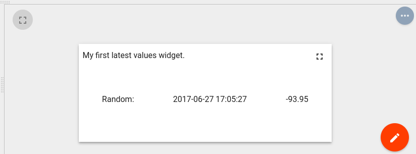
In this example, the data property of subscription is assigned to the $scope and becomes accessible within the HTML template. Inside the HTML, a special *ngFor structural angular directive is used in order to iterate over available dataKeys & datapoints then render latest values with their corresponding timestamps.
Time-Series widget
In the Widgets Bundle view, click the big “+” button at the bottom-right part of the screen, then click the “Create new widget type” button. Click the Time-Series button on the Select widget type popup. The Widget Editor will open, pre-populated with default Time-Series template widget content.
- Replace content of the CSS tab in “Resources” section with the following one:
1
2
3
.my-data-table th {
    text-align: left;
}
- Put the following HTML code inside the HTML tab of “Resources” section:
1
2
3
4
5
6
7
8
9
10
11
12
13
14
15
16
17
18
  <mat-tab-group style="height: 100%;">
      <mat-tab *ngFor="let datasource of datasources; let $dsIndex = index" label="{{datasource.name}}">
          <table class="my-data-table" style="width: 100%;">
              <thead>
                  <tr>
                      <th>Timestamp</th>
                      <th *ngFor="let dataKeyData of datasourceData[$dsIndex]">{{dataKeyData.dataKey.label}}</th>
                  <tr>
              </thead>
              <tbody>
                  <tr *ngFor="let data of datasourceData[$dsIndex][0].data; let $dataIndex = index">
                      <td>{{data[0] | date : 'yyyy-MM-dd HH:mm:ss'}}</td>
                      <td *ngFor="let dataKeyData of datasourceData[$dsIndex]">{{dataKeyData.data[$dataIndex] && dataKeyData.data[$dataIndex][1]}}</td>
                  </tr>
              </tbody>
          </table>
      </mat-tab>
  </mat-tab-group>
- Put the following JavaScript code inside the “JavaScript” section:
1
2
3
4
5
6
7
8
9
10
11
12
13
14
15
16
17
18
19
20
21
22
23
24
25
26
27
self.onInit = function() {
    self.ctx.widgetTitle = 'My first Time-Series widget';
    self.ctx.$scope.datasources = self.ctx.defaultSubscription.datasources;
    self.ctx.$scope.data = self.ctx.defaultSubscription.data;

    self.ctx.$scope.datasourceData = [];

    var currentDatasource = null;
    var currentDatasourceIndex = -1;

    for (var i=0;i<self.ctx.$scope.data.length;i++) {
        var dataKeyData = self.ctx.$scope.data[i];
        if (dataKeyData.datasource != currentDatasource) {
            currentDatasource = dataKeyData.datasource
            currentDatasourceIndex++;
            self.ctx.$scope.datasourceData[currentDatasourceIndex] = [];

        }
        self.ctx.$scope.datasourceData[currentDatasourceIndex].push(dataKeyData);
    }
    self.ctx.updateWidgetParams();

}

self.onDataUpdated = function() {
    self.ctx.detectChanges();
}
- Click the Run button on the Widget Editor Toolbar in order to see the result in Widget preview section.
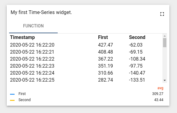
In this example, the subscription datasources and data properties are assigned to $scope and become accessible within the HTML template. The $scope.datasourceData property is introduced to map datasource specific dataKeys data by datasource index for flexible access within the HTML template. Inside the HTML, a special *ngFor structural angular directive is used in order to iterate over available datasources and render corresponding tabs. Inside each tab, the table is rendered using dataKeys obtained from datasourceData scope property accessed by datasource index. Each table renders columns by iterating over all dataKeyData objects and renders all available datapoints by iterating over data array of each dataKeyData to render timestamps and values. Note that in this code, onDataUpdated function is implemented with a call to detectChanges function necessary to perform new change detection cycle when new data is received.
RPC (Control) widget
In the Widgets Bundle view, click the big “+” button at the bottom-right part of the screen and then click the “Create new widget type” button. Click the Control Widget button on the Select widget type popup. The Widget Editor will open, pre-populated with default Control template widget content.
- Clear content of the CSS tab of “Resources” section.
- Put the following HTML code inside the HTML tab of “Resources” section:
1
2
3
4
5
6
7
8
9
10
11
12
13
14
15
16
17
18
19
20
21
22
23
24
25
26
    <form #rpcForm="ngForm" (submit)="sendCommand()">
      <div class="mat-content mat-padding" fxLayout="column">
        <mat-form-field class="mat-block">
          <mat-label>RPC method</mat-label>
          <input matInput required name="rpcMethod" #rpcMethodField="ngModel" [(ngModel)]="rpcMethod"/>
          <mat-error *ngIf="rpcMethodField.hasError('required')">
            RPC method name is required.
          </mat-error>
        </mat-form-field>
        <mat-form-field class="mat-block">
          <mat-label>RPC params</mat-label>
          <input matInput required name="rpcParams" #rpcParamsField="ngModel" [(ngModel)]="rpcParams"/>
          <mat-error *ngIf="rpcParamsField.hasError('required')">
            RPC params is required.
          </mat-error>
        </mat-form-field>
        <button [disabled]="rpcForm.invalid || !rpcForm.dirty" mat-raised-button color="primary" type="submit" >
          Send RPC command
        </button>
        <div>
          <label>RPC command response</label>
          <div style="width: 100%; height: 100px; border: solid 2px gray" [innerHTML]="rpcCommandResponse">
          </div>
        </div>
      </div>
    </form>
- Put the following JSON content inside the “Settings schema” tab of Settings schema section:
1
2
3
4
5
6
7
8
9
10
11
12
13
14
15
16
17
18
19
20
21
22
23
{
    "schema": {
        "type": "object",
        "title": "Settings",
        "properties": {
            "oneWayElseTwoWay": {
                "title": "Is One Way Command",
                "type": "boolean",
                "default": true
            },
            "requestTimeout": {
                "title": "RPC request timeout",
                "type": "number",
                "default": 500
            }
        },
        "required": []
    },
    "form": [
        "oneWayElseTwoWay",
        "requestTimeout"
    ]
}
- Put the following JavaScript code inside the “JavaScript” section:
1
2
3
4
5
6
7
8
9
10
11
12
13
14
15
16
17
18
19
20
21
22
23
24
25
26
27
28
29
30
31
32
33
34
35
self.onInit = function() {
self.ctx.$scope.sendCommand = function() {
var rpcMethod = self.ctx.$scope.rpcMethod;
var rpcParams = self.ctx.$scope.rpcParams;
var timeout = self.ctx.settings.requestTimeout;
var oneWayElseTwoWay = self.ctx.settings.oneWayElseTwoWay ? true : false;
var commandObservable;
if (oneWayElseTwoWay) {
commandObservable = self.ctx.controlApi.sendOneWayCommand(rpcMethod, rpcParams, timeout);
} else {
commandObservable = self.ctx.controlApi.sendTwoWayCommand(rpcMethod, rpcParams, timeout);
}
commandObservable.subscribe(
function (response) {
if (oneWayElseTwoWay) {
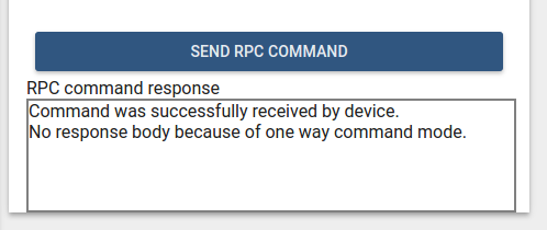
self.ctx.$scope.rpcCommandResponse = "Command was successfully received by device.<br> No response body because of one way command mode.";
} else {
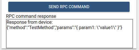
self.ctx.$scope.rpcCommandResponse = "Response from device:<br>";
self.ctx.$scope.rpcCommandResponse += JSON.stringify(response, undefined, 2);
}
self.ctx.detectChanges();
},
function (rejection) {
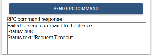
self.ctx.$scope.rpcCommandResponse = "Failed to send command to the device:<br>"
self.ctx.$scope.rpcCommandResponse += "Status: " + rejection.status + "<br>";
self.ctx.$scope.rpcCommandResponse += "Status text: '" + rejection.statusText + "'";
self.ctx.detectChanges();
}
);
}
}
- Fill Widget title field with widget type name, for ex. “My first control widget”.
- Click the Run button on the Widget Editor Toolbar in order to see the result in Widget preview section.
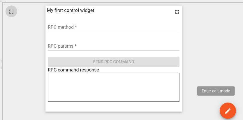
- Click dashboard edit button on the preview section to change the size of the resulting widget. Then click dashboard apply button. The final widget should look like the image below.
- Click the Save button on the Widget Editor Toolbar to save widget type.
To test how this widget performs RPC commands, we will need to place it in a dashboard then bind it to a device working with RPC commands. To do this, perform the following steps:
- Login as Tenant administrator.
- Navigate to Devices and create new device with some name, for ex. “My RPC Device”.
- Open device details and click “Copy Access Token” button to copy device access token to clipboard.
- Download mqtt-js-rpc-from-server.sh and mqtt-js-rpc-from-server.js. Place these files in a folder. Edit mqtt-js-rpc-from-server.sh - replace $ACCESS_TOKEN with your device access token from the clipboard. And install mqtt client library.
- Run mqtt-js-rpc-from-server.sh script. You should see a “connected” message in the console.
- Navigate to Dashboards and create a new dashboard with some name, for ex. “My first control dashboard”. Open this dashboard.
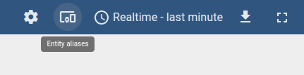
- Click dashboard “edit” button. In the dashboard edit mode, click the “Entity aliases” button located on the dashboard toolbar.
- Inside Entity aliases popup click “Add alias”.
- Fill “Alias name” field, for ex. “My RPC Device Alias”.
- Select “Entity list” in “Filter type” field.
- Choose “Device” in “Type” field.
- Select your device in “Entity list” field. In this example “My RPC Device”.
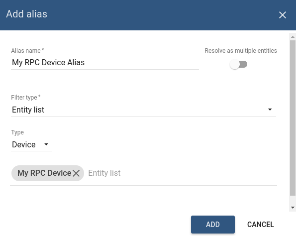
- Click “Add” and then “Save” in Entity aliases.
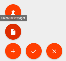
- Click dashboard “+” button then click “Create new widget” button.
- Then select Widget Bundle where your RPC widget was saved. Select “Control widget” tab.
- Click your widget. In this example, “My first control widget”.
- From Add Widget popup, select your device alias in Target device section. In this example “My RPC Device Alias”.
- Click Add. Your Control widget will appear in the dashboard. Click dashboard Apply changes button to save dashboard and leave editing mode.
- Fill RPC method field with RPC method name. For ex. “TestMethod”.
- Fill RPC params field with RPC params. For ex. “{ param1: “value1” }”.
- Click Send RPC command button. You should see the following response in the widget.
The following output should be printed in the device console:
1
2
  request.topic: v1/devices/me/rpc/request/0
  request.body: {"method":"TestMethod","params":"{ param1: \"value1\" }"}
In order to test “Two way” RPC command mode, we need to change the corresponding widget settings property. To do this, perform the following steps:
- Click dashboard “edit” button. In dashboard edit mode, click Edit widget button located in the header of Control widget.
- In the widget details, view select “Advanced” tab and uncheck “Is One Way Command” checkbox.
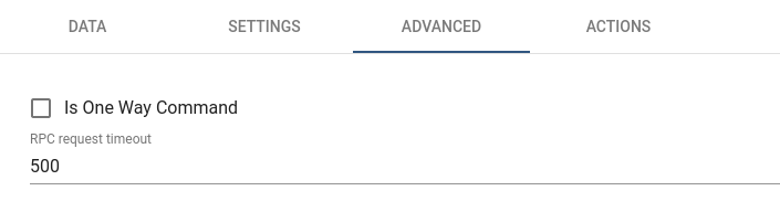
- Click Apply changes button on the widget details header. Close details and click dashboard Apply changes button.
- Fill widget fields with RPC method name and params like in previous steps. Click Send RPC command button. You should see the following response in the widget.
- stop mqtt-js-rpc-from-server.sh script. Click Send RPC command button. You should see the following response in the widget.
In this example, controlApi is used to send RPC commands. Additionally, custom widget settings were introduced in order to configure RPC command mode and RPC request timeout. The response from the device is handled by commandObservable. It has success and failed callbacks with corresponding response, or rejection objects containing information about request execution result.
Alarm widget
In the Widgets Bundle view, click the big “+” button at the bottom-right part of the screen and then click the “Create new widget type” button. Click the Alarm Widget button on the Select widget type popup. The Widget Editor will be opened, pre-populated with the content of the default Alarm template widget.
- Replace content of the CSS tab in “Resources” section with the following one:
1
2
3
.my-alarm-table th {
    text-align: left;
}
- Put the following HTML code inside the HTML tab of “Resources” section:
1
2
3
4
5
6
7
8
9
10
11
12
13
14
15
16
17
18
  <div fxFlex fxLayout="column" style="height: 100%;">
      <div>My first Alarm widget.</div>
      <table class="my-alarm-table" style="width: 100%;">
          <thead>
              <tr>
                  <th *ngFor="let dataKey of alarmSource?.dataKeys">{{dataKey.label}}</th>
              <tr>
          </thead>
          <tbody>
              <tr *ngFor="let alarm of alarms">
                  <td *ngFor="let dataKey of alarmSource?.dataKeys"
                      [ngStyle]="getAlarmCellStyle(alarm, dataKey)">
                      {{getAlarmValue(alarm, dataKey)}}
                  </td>
              </tr>
          </tbody>
      </table>
  </div>
- Put the following JSON content inside the “Settings schema” tab of Settings schema section:
1
2
3
4
5
6
7
8
9
10
11
12
13
14
15
16
17
18
19
20
{
    "schema": {
        "type": "object",
        "title": "AlarmTableSettings",
        "properties": {
            "alarmSeverityColorFunction": {
                "title": "Alarm severity color function: f(severity)",
                "type": "string",
                "default": "if(severity == 'CRITICAL') {return 'red';} else if (severity == 'MAJOR') {return 'orange';} else return 'green'; "
            }
        },
        "required": []
    },
    "form": [
        {
            "key": "alarmSeverityColorFunction",
            "type": "javascript"
        }
    ]
}
- Put the following JavaScript code inside the “JavaScript” section:
1
2
3
4
5
6
7
8
9
10
11
12
13
14
15
16
17
18
19
20
21
22
23
24
25
26
27
28
29
30
31
32
33
34
35
36
37
38
39
40
41
42
43
44
45
46
47
48
49
50
51
52
53
self.onInit = function() {
    var pageLink = self.ctx.pageLink();

    pageLink.typeList = self.ctx.widgetConfig.alarmTypeList;
    pageLink.statusList = self.ctx.widgetConfig.alarmStatusList;
    pageLink.severityList = self.ctx.widgetConfig.alarmSeverityList;
    pageLink.searchPropagatedAlarms = self.ctx.widgetConfig.searchPropagatedAlarms;

    self.ctx.defaultSubscription.subscribeForAlarms(pageLink, null);
    self.ctx.$scope.alarmSource = self.ctx.defaultSubscription.alarmSource;

    var alarmSeverityColorFunctionBody = self.ctx.settings.alarmSeverityColorFunction;
    if (typeof alarmSeverityColorFunctionBody === 'undefined' || !alarmSeverityColorFunctionBody.length) {
        alarmSeverityColorFunctionBody = "if(severity == 'CRITICAL') {return 'red';} else if (severity == 'MAJOR') {return 'orange';} else return 'green';";
    }

    var alarmSeverityColorFunction = null;
    try {
        alarmSeverityColorFunction = new Function('severity', alarmSeverityColorFunctionBody);
    } catch (e) {
        alarmSeverityColorFunction = null;
    }

    self.ctx.$scope.getAlarmValue = function(alarm, dataKey) {
        var alarmKey = dataKey.name;
        if (alarmKey === 'originator') {
            alarmKey = 'originatorName';
        }
        var value = alarm[alarmKey];
        if (alarmKey === 'createdTime') {
            return self.ctx.date.transform(value, 'yyyy-MM-dd HH:mm:ss');
        } else {
            return value;
        }
    }

    self.ctx.$scope.getAlarmCellStyle = function(alarm, dataKey) {
        var alarmKey = dataKey.name;
        if (alarmKey === 'severity' && alarmSeverityColorFunction) {
            var severity = alarm[alarmKey];
            var color = alarmSeverityColorFunction(severity);
            return {
                color: color
            };
        }
        return {};
    }
}

self.onDataUpdated = function() {
    self.ctx.$scope.alarms = self.ctx.defaultSubscription.alarms.data;
    self.ctx.detectChanges();
}
- Click the Run button on the Widget Editor Toolbar in order to see the result in Widget preview section.
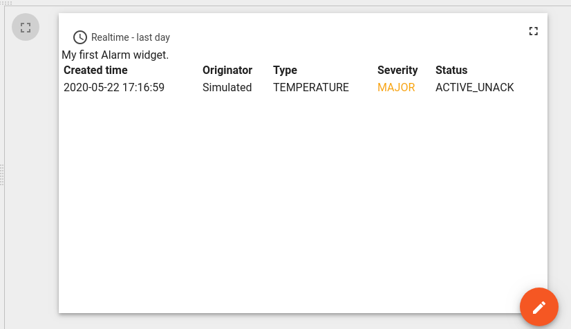
In this example, the alarmSource and alarms properties of subscription are assigned to $scope and become accessible within HTML template. Inside the HTML, a special *ngFor structural angular directive is used in order to iterate over available alarm dataKeys of alarmSource and render corresponding columns. The table rows are rendered by iterating over alarms array and corresponding cells rendered by iterating over dataKeys. The function getAlarmValue is fetching alarm value and formatting createdTime alarm property using a DatePipe angular pipe accessible via date property of ctx. The function getAlarmCellStyle is used to assign custom cell styles for each alarm cell. In this example, we introduced new settings property called alarmSeverityColorFunction that contains function body returning color depending on alarm severity. Inside the getAlarmCellStyle function there is corresponding invocation of alarmSeverityColorFunction with severity value in order to get color for alarm severity cell. Note that in this code onDataUpdated function is implemented in order to update alarms property with latest alarms from subscription and invoke change detection using detectChanges() function.
Static widget
In the Widgets Bundle view, click the big “+” button at the bottom-right part of the screen and then click the “Create new widget type” button. Click the Static Widget button on the Select widget type popup. The Widget Editor will be opened pre-populated with the content of default Static template widget.
- Put the following HTML code inside the HTML tab of “Resources” section:
1
2
3
4
  <div fxFlex fxLayout="column" style="height: 100%;" fxLayoutAlign="space-around stretch">
    <h3 style="text-align: center;">My first static widget.</h3>
    <button mat-raised-button color="primary" (click)="showAlert()">Click me</button>
  </div>
- Put the following JSON content inside the “Settings schema” tab of Settings schema section:
1
2
3
4
5
6
7
8
9
10
11
12
13
14
15
16
{
    "schema": {
        "type": "object",
        "title": "Settings",
        "properties": {
            "alertContent": {
                "title": "Alert content",
                "type": "string",
                "default": "Content derived from alertContent property of widget settings."
            }
        }
    },
    "form": [
        "alertContent"
    ]
}
- Put the following JavaScript code inside the “JavaScript” section:
1
2
3
4
5
6
7
8
9
10
11
self.onInit = function() {

    self.ctx.$scope.showAlert = function() {
        var alertContent = self.ctx.settings.alertContent;
        if (!alertContent) {
            alertContent = "Content derived from alertContent property of widget settings.";
        }
        window.alert(alertContent);
    };

}
- Click the Run button on the Widget Editor Toolbar to see the resulting Widget preview section.
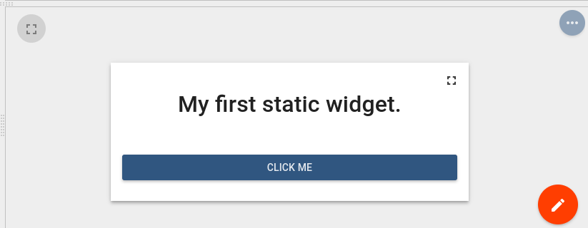
This is just a static HTML widget. There is no subscription data and no special widget API was used. Only custom showAlert function was implemented showing an alert with the content of alertContent property of widget settings. You can switch to dashboard edit mode in Widget preview section and change value of alertContent by changing widget settings in the “Advanced” tab of widget details. Then you can see that the new alert content is displayed.
Integrating existing code to create widget definition
Below are some examples demonstrating how external JavaScript libraries or existing code can be reused/integrated to create new widgets.
Using external JavaScript library
Latest Values Example
In this example, Latest Values gauge widget will be created using external gauge.js library.
In the Widgets Bundle view, click the big “+” button at the bottom-right part of the screen, then click the “Create new widget type” button. Click the Latest Values button on the Select widget type popup. The Widget Editor will be opened, pre-populated with the content of default Latest Values template widget.
- Open Resources tab and click “Add” then insert the following link:
1
https://bernii.github.io/gauge.js/dist/gauge.min.js
- Clear content of the CSS tab of “Resources” section.
- Put the following HTML code inside the HTML tab of “Resources” section:
1
  <canvas id="my-gauge"></canvas>
- Put the following JavaScript code inside the “JavaScript” section:
1
2
3
4
5
6
7
8
9
10
11
12
13
14
15
16
17
18
19
20
21
22
23
24
25
var canvasElement;
var gauge;

self.onInit = function() {
    canvasElement = $('#my-gauge', self.ctx.$container)[0];
    gauge = new Gauge(canvasElement);
    gauge.minValue = -1000;
    gauge.maxValue = 1000;
    gauge.animationSpeed = 16;
    self.onResize();
}

self.onResize = function() {
    canvasElement.width = self.ctx.width;
    canvasElement.height = self.ctx.height;
    gauge.update(true);
    gauge.render();
}

self.onDataUpdated = function() {
    if (self.ctx.defaultSubscription.data[0].data.length) {
        var value = self.ctx.defaultSubscription.data[0].data[0][1];
        gauge.set(value);
    }
}
- Click the Run button on the Widget Editor Toolbar in order to see the result in Widget preview section.
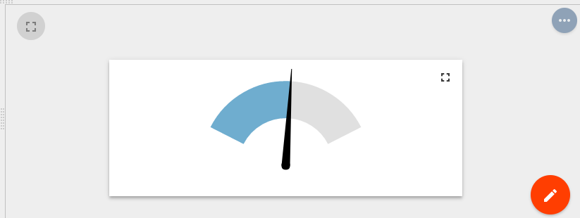
In this example, the external JS library API was used that becomes available after injecting the corresponding URL in Resources section. The value displayed was obtained from subscription data property for the first dataKey.
Time-Series Example
In this example, Time-Series line chart widget will be created using external Chart.js library.
In the Widgets Bundle view, click the big “+” button at the bottom-right part of the screen, then click the “Create new widget type” button. Click the Time-Series button on the Select widget type popup. The Widget Editor will be opened, pre-populated with the content of default Time-Series template widget.
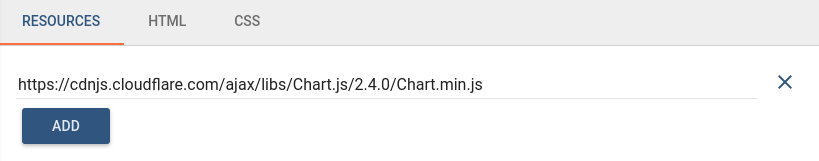
- Open Resources tab and click “Add” then insert the following link:
1
https://cdnjs.cloudflare.com/ajax/libs/Chart.js/2.9.3/Chart.min.js
- Clear content of the CSS tab of “Resources” section.
- Put the following HTML code inside the HTML tab of “Resources” section:
1
  <canvas id="myChart"></canvas>
- Put the following JavaScript code inside the “JavaScript” section:
1
2
3
4
5
6
7
8
9
10
11
12
13
14
15
16
17
18
19
20
21
22
23
24
25
26
27
28
29
30
31
32
33
34
35
36
37
38
39
40
41
42
43
44
45
46
47
48
49
50
51
52
53
54
55
56
57
58
59
60
61
62
63
64
65
66
var myChart;

self.onInit = function() {

    var chartData = {
        datasets: []
    };

    for (var i=0; i < self.ctx.data.length; i++) {
        var dataKey = self.ctx.data[i].dataKey;
        var dataset = {
            label: dataKey.label,
            data: [],
            borderColor: dataKey.color,
            fill: false
        };
        chartData.datasets.push(dataset);
    }

    var options = {
        maintainAspectRatio: false,
        legend: {
            display: false
        },
        scales: {
        xAxes: [{
            type: 'time',
            ticks: {
                maxRotation: 0,
                autoSkipPadding: 30
            }
        }]
    }
    };

    var canvasElement = $('#myChart', self.ctx.$container)[0];
    var canvasCtx = canvasElement.getContext('2d');
    myChart = new Chart(canvasCtx, {
        type: 'line',
        data: chartData,
        options: options
    });
    self.onResize();
}

self.onResize = function() {
    myChart.resize();
}

self.onDataUpdated = function() {
    for (var i = 0; i < self.ctx.data.length; i++) {
        var datasourceData = self.ctx.data[i];
        var dataSet = datasourceData.data;
        myChart.data.datasets[i].data.length = 0;
        var data = myChart.data.datasets[i].data;
        for (var d = 0; d < dataSet.length; d++) {
            var tsValuePair = dataSet[d];
            var ts = tsValuePair[0];
            var value = tsValuePair[1];
            data.push({t: ts, y: value});
        }
    }
    myChart.options.scales.xAxes[0].ticks.min = self.ctx.timeWindow.minTime;
    myChart.options.scales.xAxes[0].ticks.max = self.ctx.timeWindow.maxTime;
    myChart.update();
}
- Click the Run button on the Widget Editor Toolbar in order to see the result in Widget preview section.
In this example, the external JS library API was used that becomes available after injecting the corresponding URL in Resources section. Initially chart datasets prepared using configured dataKeys from data property of ctx. In the onDataUpdated function datasources data converted to Chart.js line chart format and pushed to chart datasets. Please note that xAxis (time axis) is limited to current timewindow bounds obtained from timeWindow property of ctx.
Using existing JavaScript code
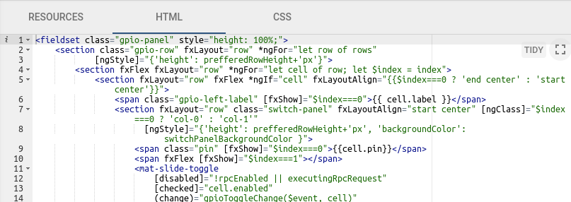
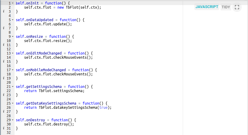
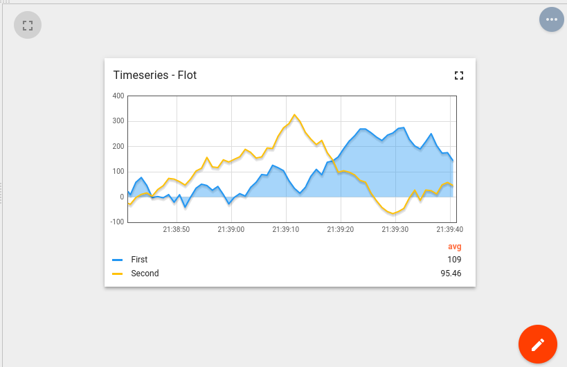
Another approach of creating widgets is to use existing bundled JavaScript code. In this case, you can create own TypeScript class or Angular component and bundle it into the IoT Hub UI code. In order to make this code accessible within the widget, you need to register corresponding Angular module or inject TypeScript class to a global variable (for ex. window object). Some of the IoT Hub widgets already use this approach. Take a look at the polyfills.ts or widget-components.module.ts. Here you can find how some bundled classes or components are registered for later use in IoT Hub widgets. For example “Timeseries - Flot” widget (from “Charts” Widgets Bundle) uses TbFlot TypeScript class which is injected as window property inside polyfills.ts:
1
2
3
4
5
6
7
8
...

import { TbFlot } from '@home/components/widget/lib/flot-widget';
...

    (window as any).TbFlot = TbFlot;
...
Another example is “Timeseries table” widget (from “Cards” Widgets Bundle) that uses Angular component tb-timeseries-table-widget which is registered as dependency of WidgetComponentsModule Angular module inside widget-components.module.ts. Thereby this component becomes available for use inside the widget template HTML.
1
2
3
4
5
6
7
8
9
10
11
12
13
14
15
16
17
18
19
20
21
22
...

import { TimeseriesTableWidgetComponent } from '@home/components/widget/lib/timeseries-table-widget.component';

...

@NgModule({
  declarations:
    [
...
      TimeseriesTableWidgetComponent,
...
    ],
...
  exports: [
...
      TimeseriesTableWidgetComponent,
...
  ],
...
})
export class WidgetComponentsModule { }
Widget code debugging tips
The most simple method of debugging is Web console output. Just place console.log(…) function inside any part of widget JavaScript code. Then click Run button to restart widget code and observe debug information in the Web console.
Another and most effective method of debugging is to invoke browser debugger. Put debugger; statement into the place of widget code you are interested in and then click Run button to restart widget code. Browser debugger (if enabled) will automatically pause code execution at the debugger statement and you will be able to analyze script execution using browser debugging tools.
Next steps
- Getting started guides - These guides provide quick overview of main IoT Hub features. Designed to be completed in 15-30 minutes.
-
Connect your device - Learn how to connect devices based on your connectivity technology or solution.
-
Data visualization - These guides contain instructions how to configure complex IoT Hub dashboards.
-
Data processing & actions - Learn how to use IoT Hub Rule Engine.
-
IoT Data analytics - Learn how to use rule engine to perform basic analytics tasks.
-
Hardware samples - Learn how to connect various hardware platforms to IoT Hub.
-
Advanced features - Learn about advanced IoT Hub features.