
Introduction
Advanced data keys configuration is responsible for the visibility, style, and appearance of a specific data key column on the widget. Entity table widget, alarms table widget, and entity admin widget bundles have the same advanced data key configuration. Charts widget bundle has its own unique advanced data key configuration. All other widget bundles have only basic data key configuration.
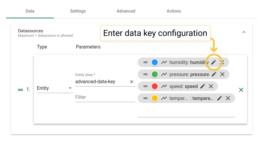
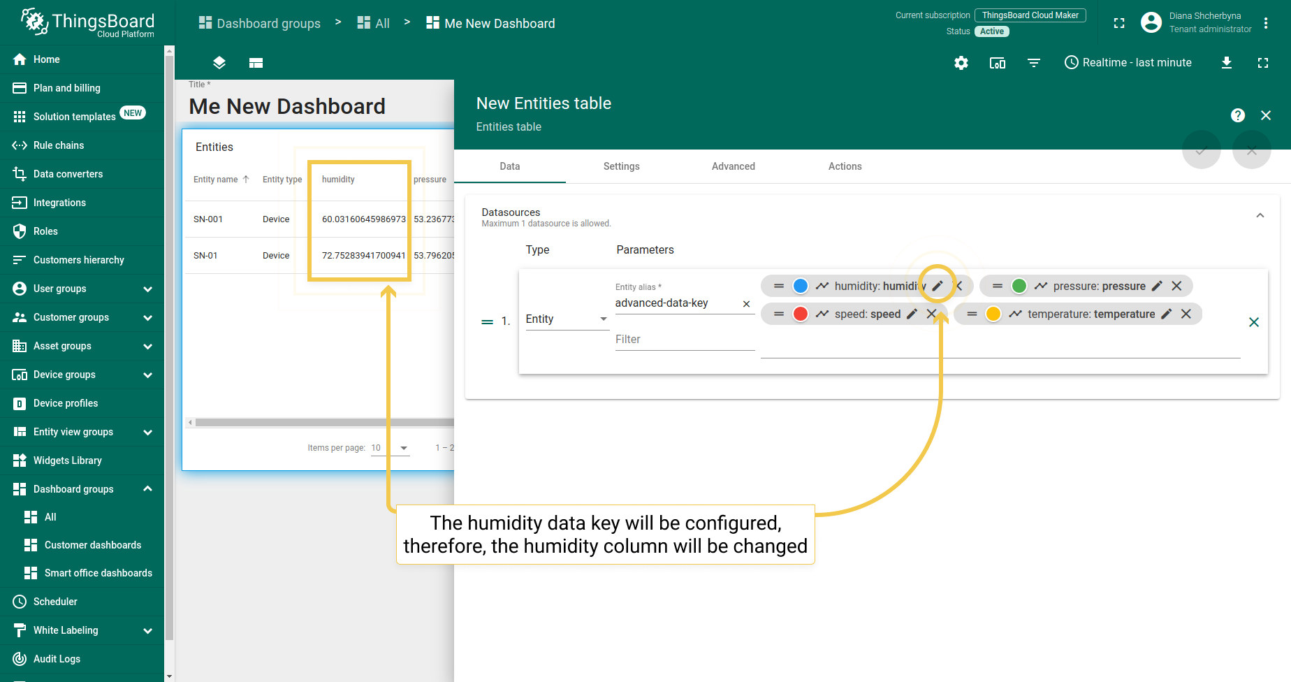
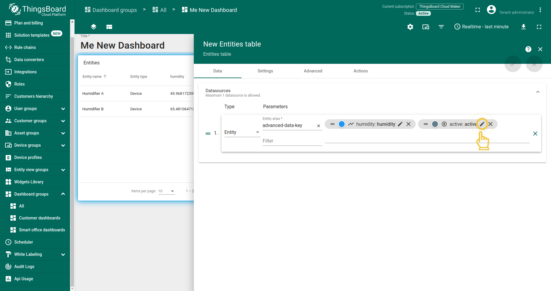
To enter a data key configuration, you should click the pencil icon on the specific data key that you’d like to adjust.
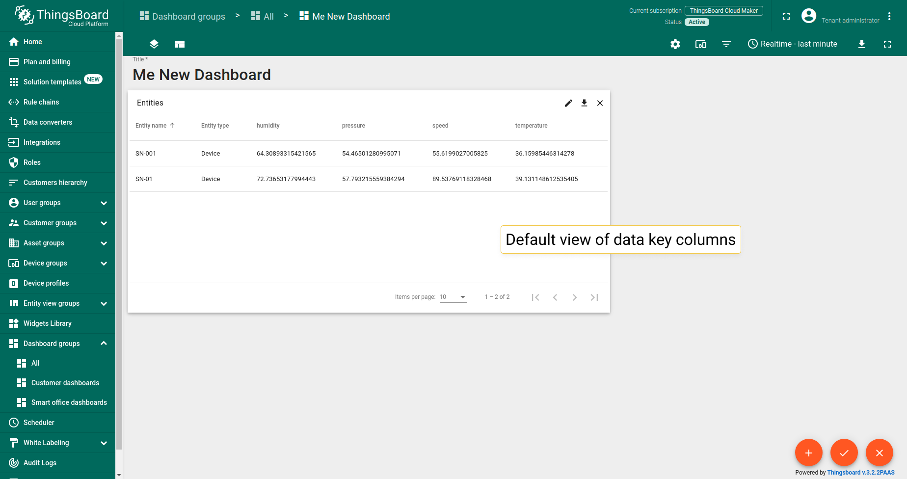
1. Entity table and alarms table widgets
Entity table widget, alarms table widget, and entity admin widget bundle have the same advanced data key configuration. Let’s break advanced configuration down with an example on the entity table widget from the cards bundle.
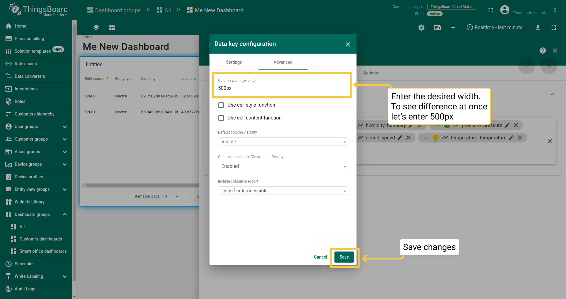
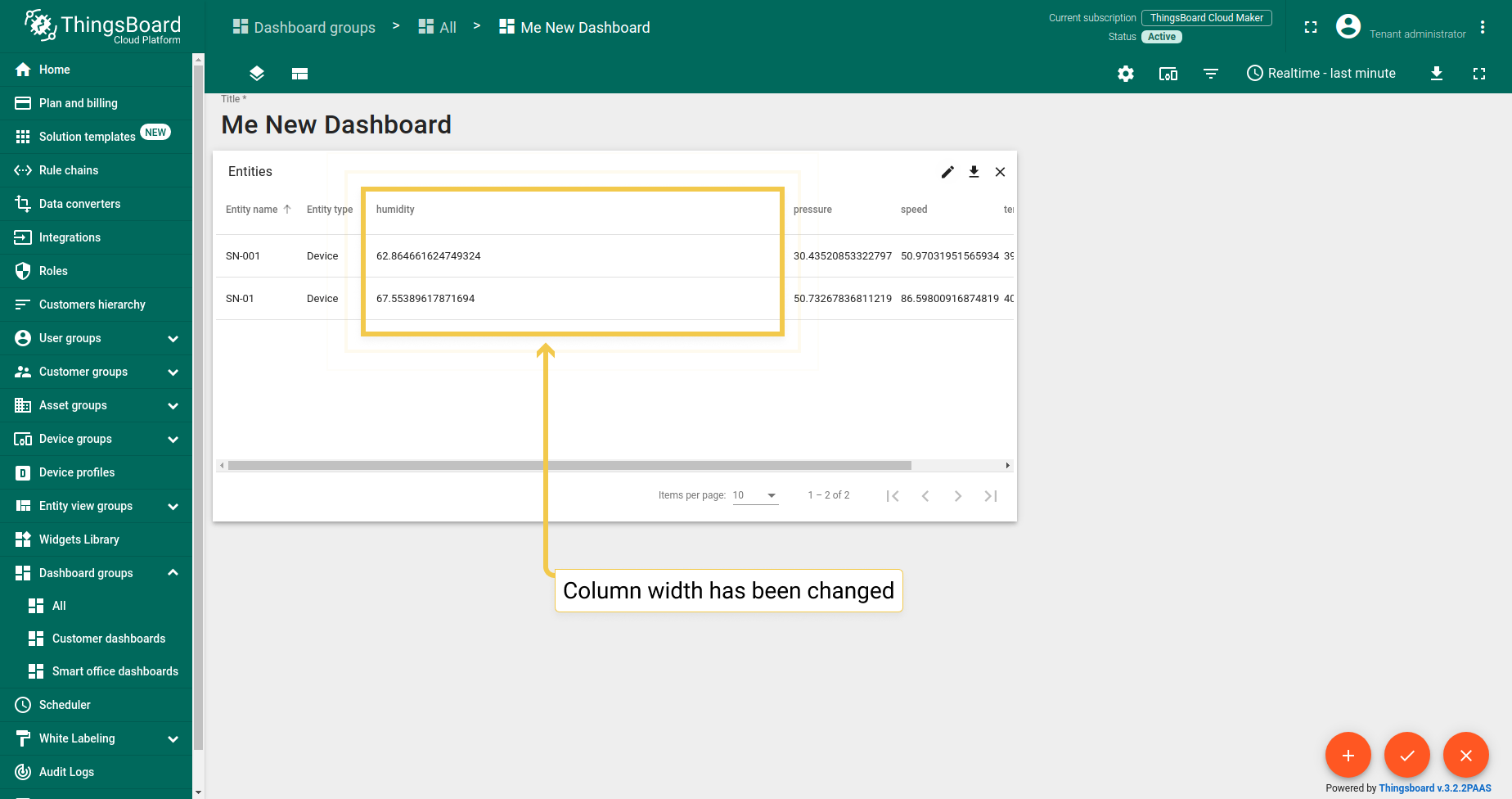
1.1. Column width (px or %)
The column width bar allows you to adjust the width of the column in pixels or percentage. Manually enter the desired width (for example, 500px) and click “Save” in the lower right corner of the dialog box. In the same way, you can change the width as a percentage.
1.2. Cell style function
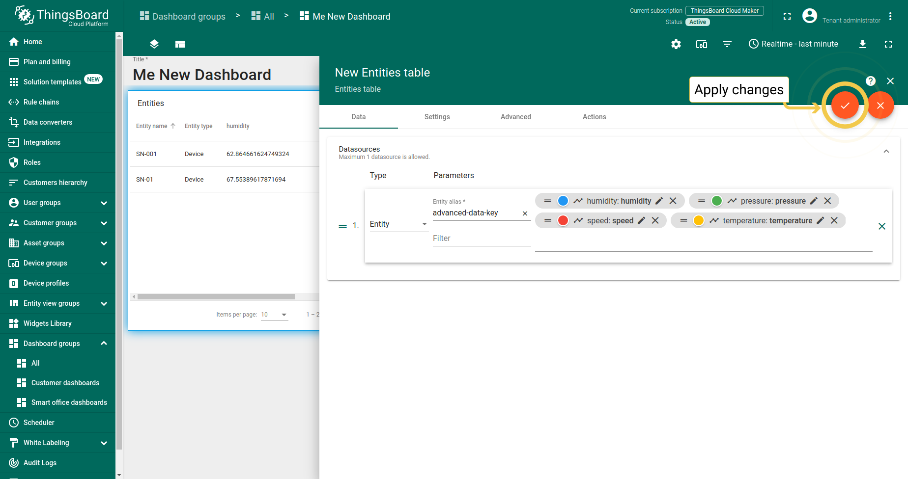
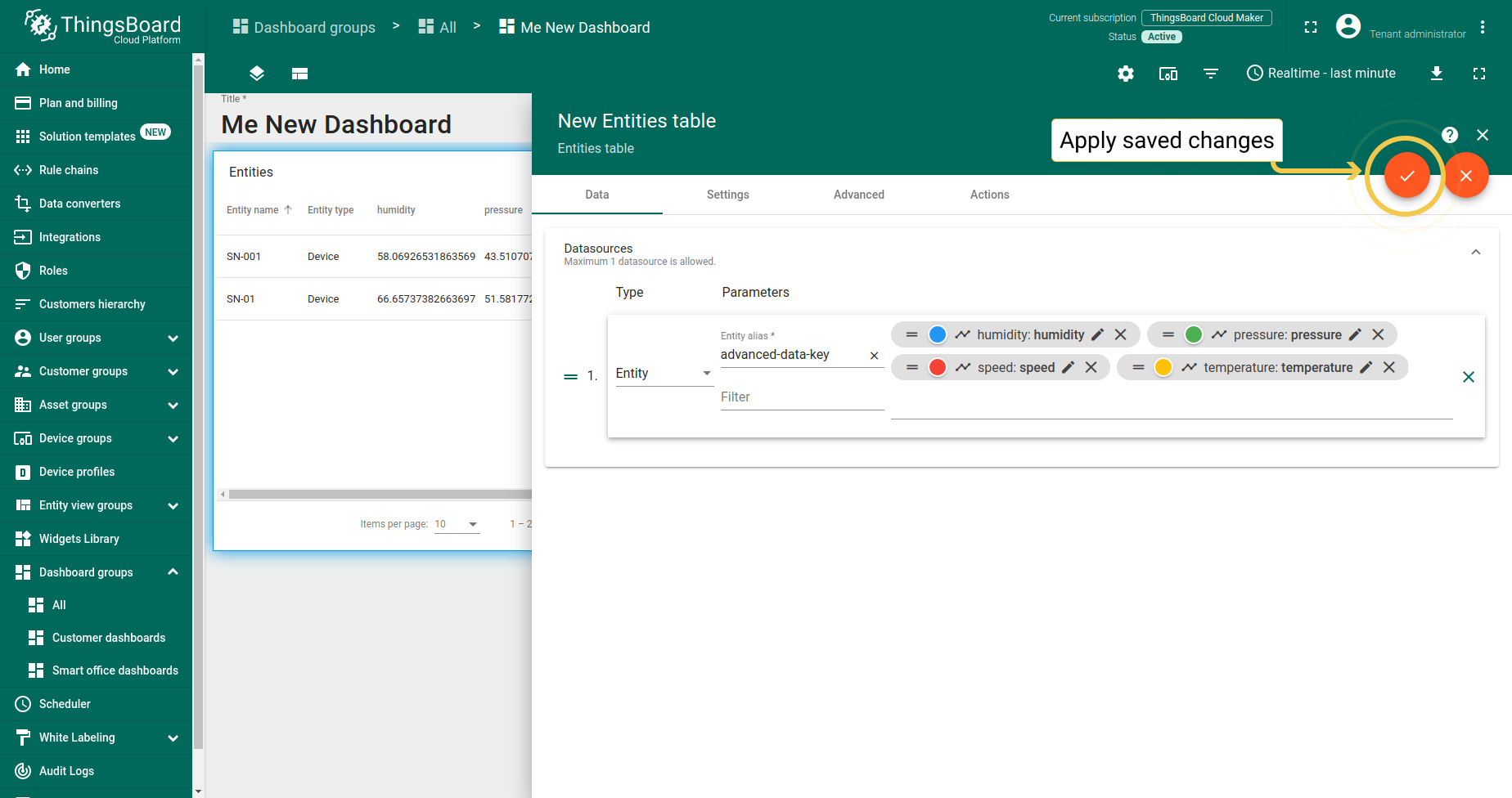
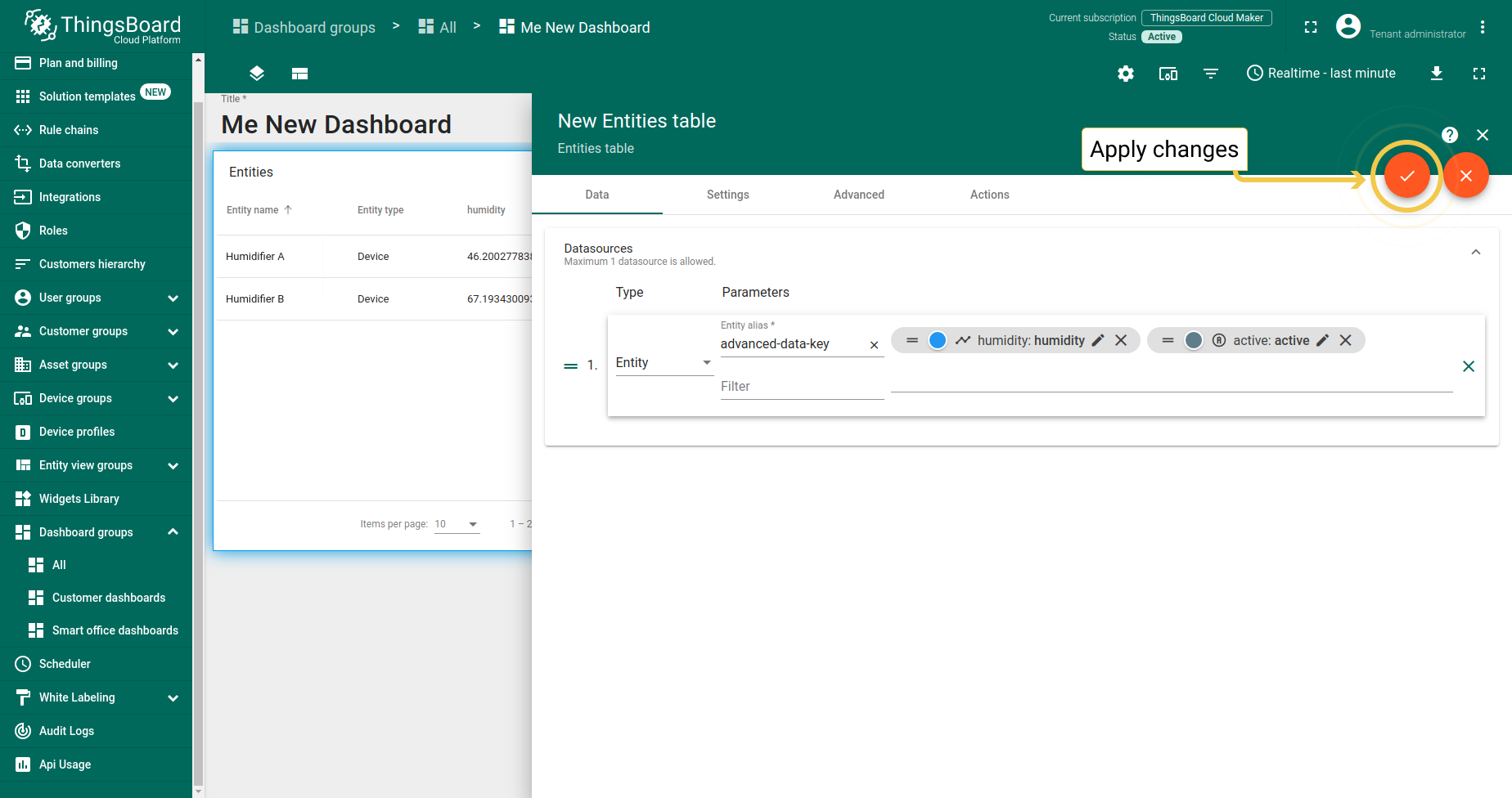
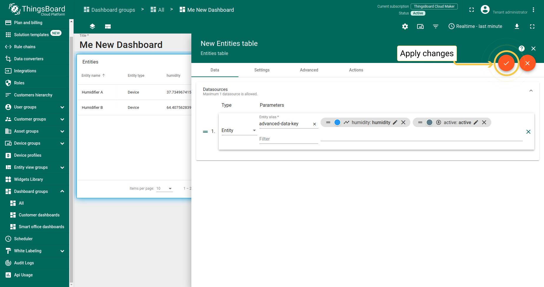
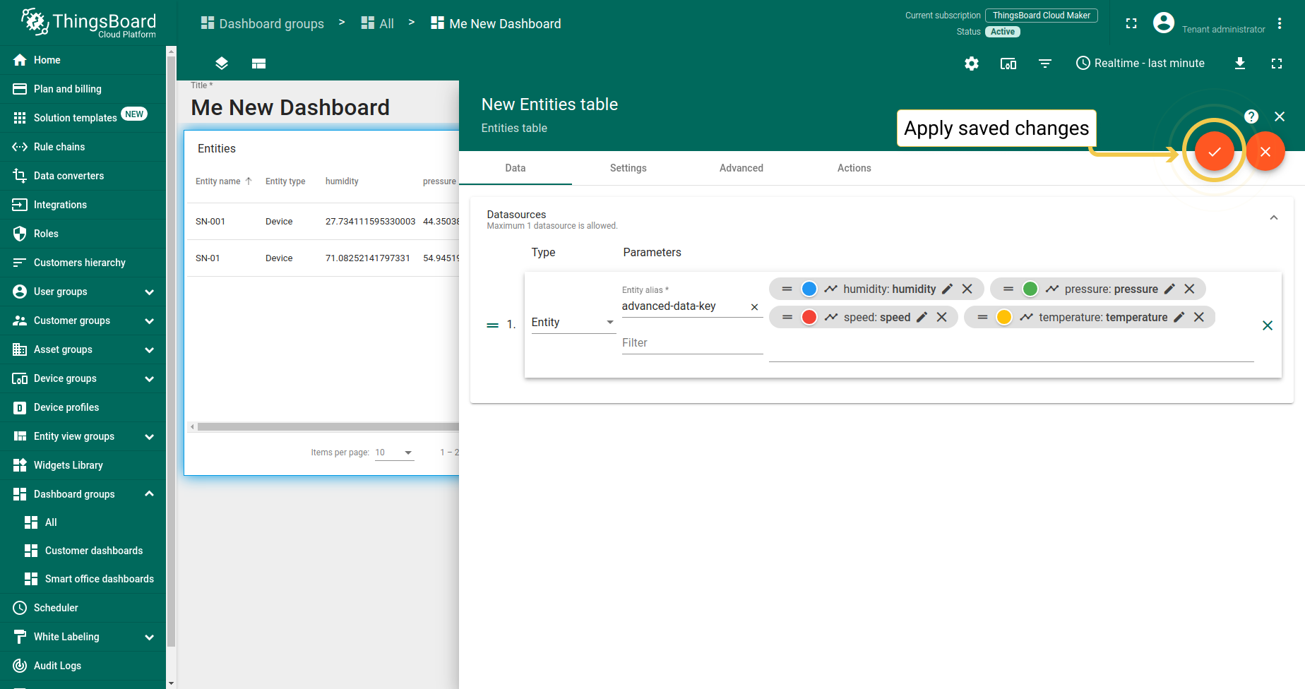
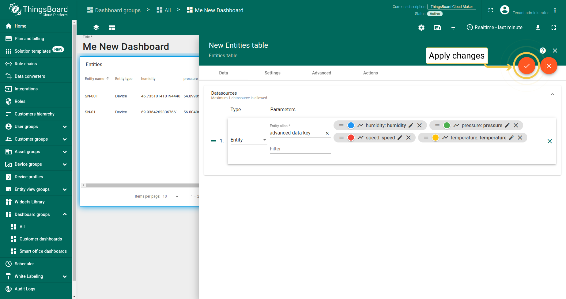
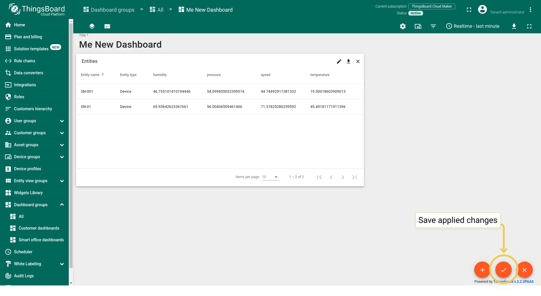
Cell style function allows adjusting color of rows based on values, entity, or ctx. The time series table widget also has a cell style function. To configure the cell style function, you should check the box Use cell style function and input the function in the field below. Then, click the “Save” button in the lower right corner of the Data key configuration dialog. To apply changes, click the big orange checkmark in the upper right corner of the widget edit mode. To save applied changes, click the orange checkmark in the lower right corner of the dashboard edit mode.
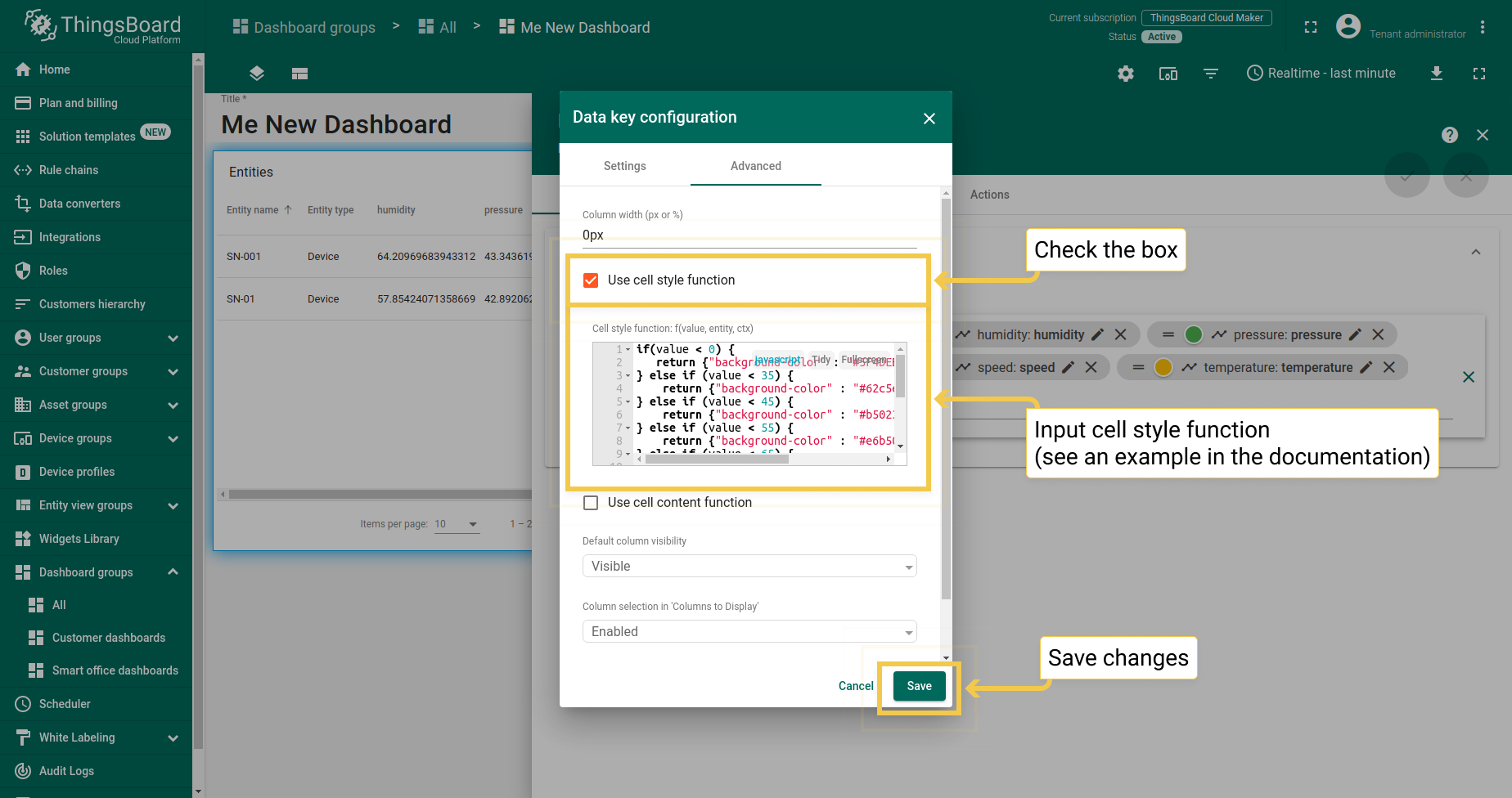
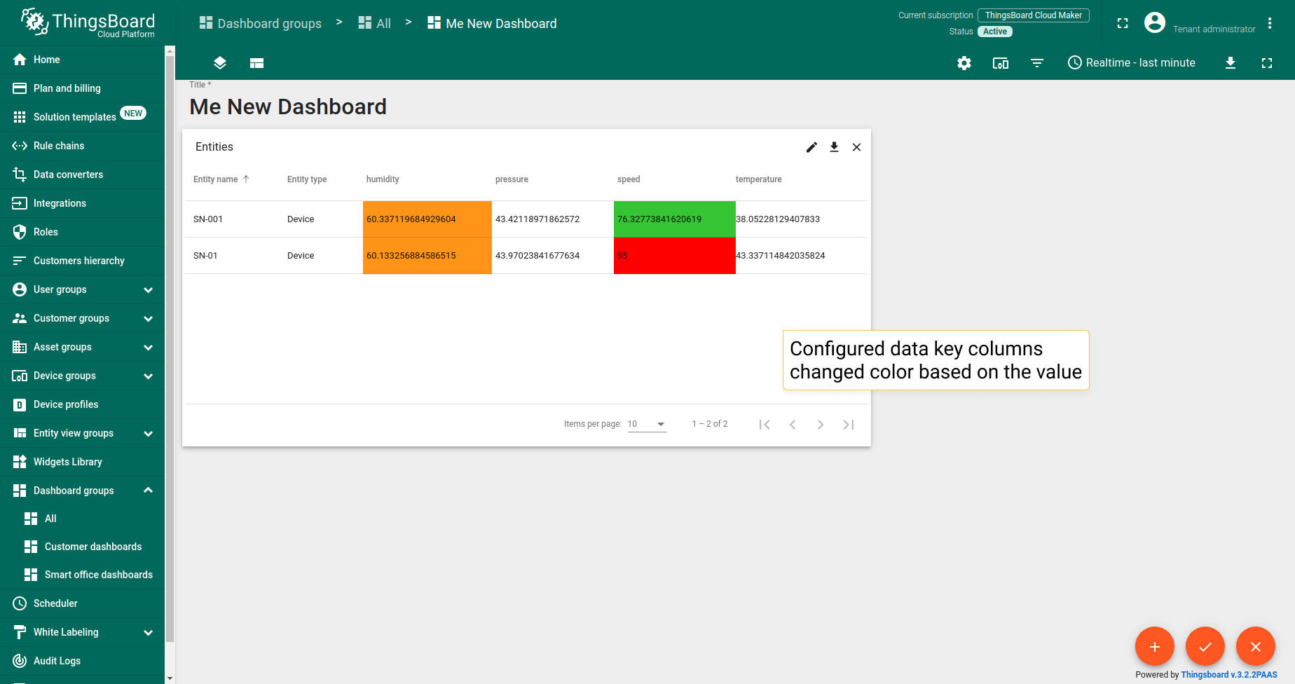
An example of a cell style function:
1
2
3
4
5
6
7
8
9
10
11
12
13
14
15
16
17
if(value < 0) {
   return {"background-color" : "#5F4DEB"};
} else if (value < 35) {
    return {"background-color" : "#62c5e3", "color" : "#19154a"};
} else if (value < 45) {
    return {"background-color" : "#b50232", "color" : "#f7e18f"};
} else if (value < 55) {
    return {"background-color" : "#e6b500", "color" : "#ff2200"};
} else if (value < 65) {
    return {"background-color" : "#ff9419"};
} else if (value < 75) {
    return {"background-color" : "#d0ff00"};
} else if (value < 85) {
    return {"background-color" : "#35c433"};
} else {
    return { "background-color" : "red" };
}
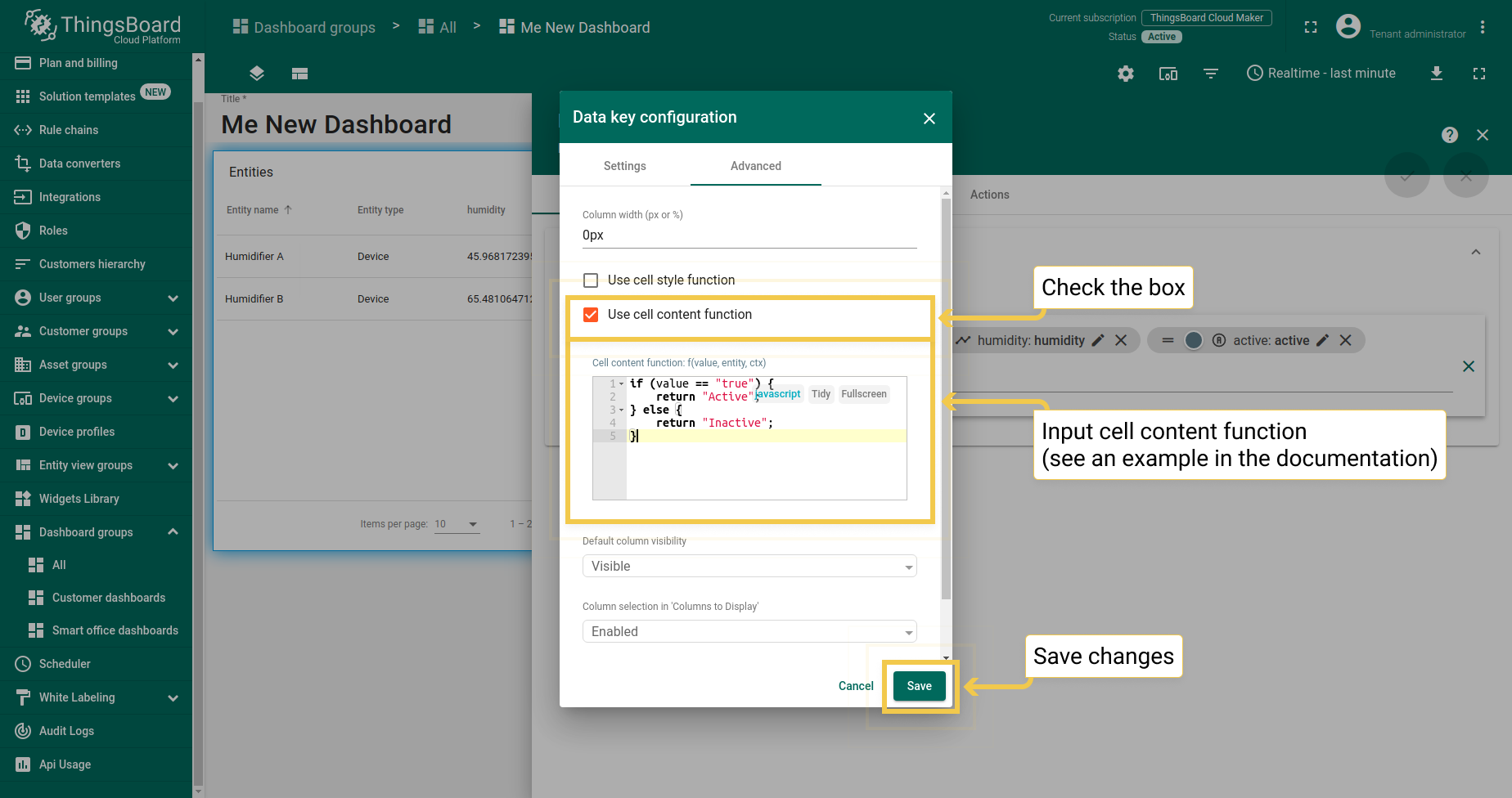
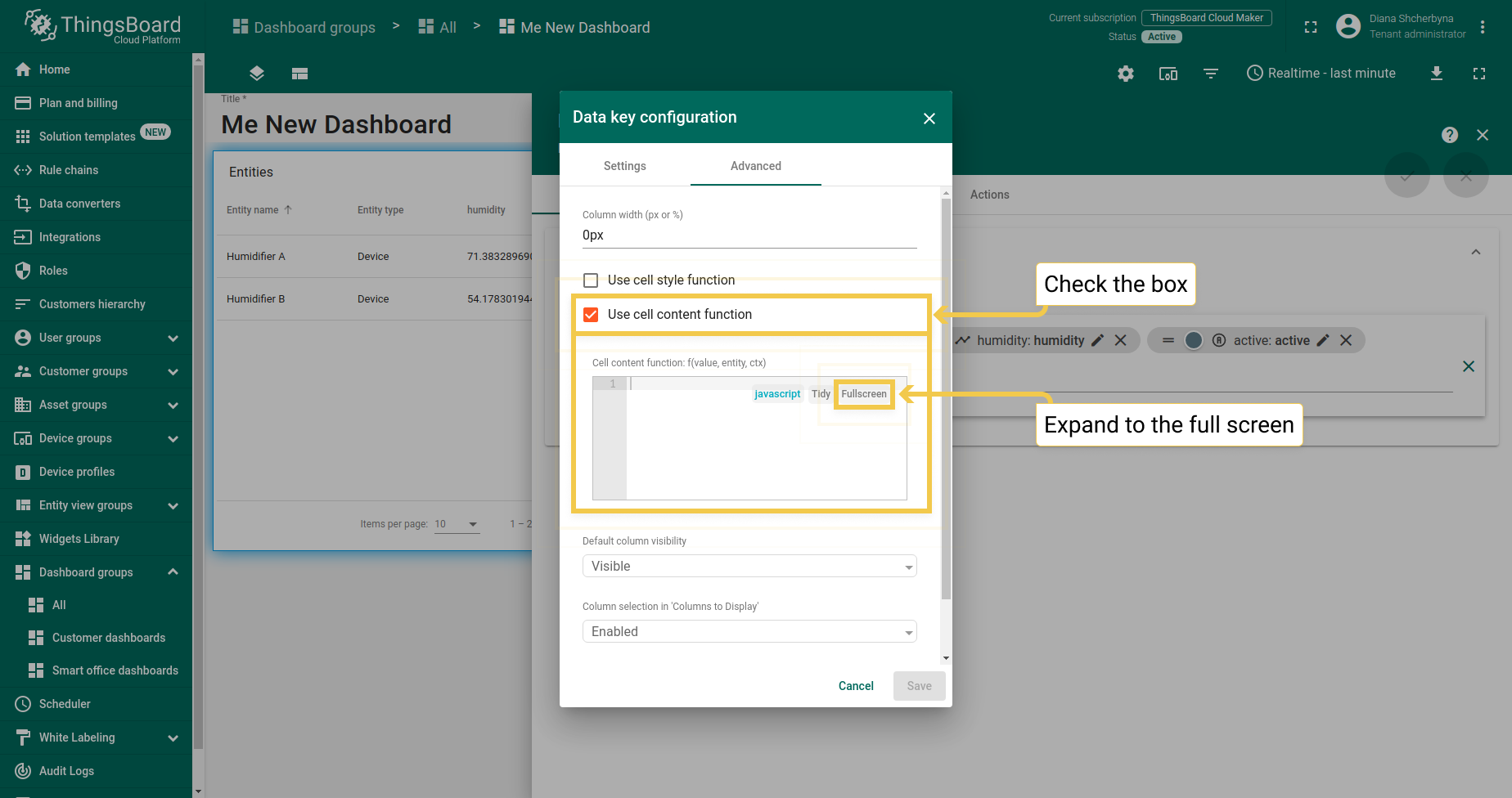
1.3. Cell content function
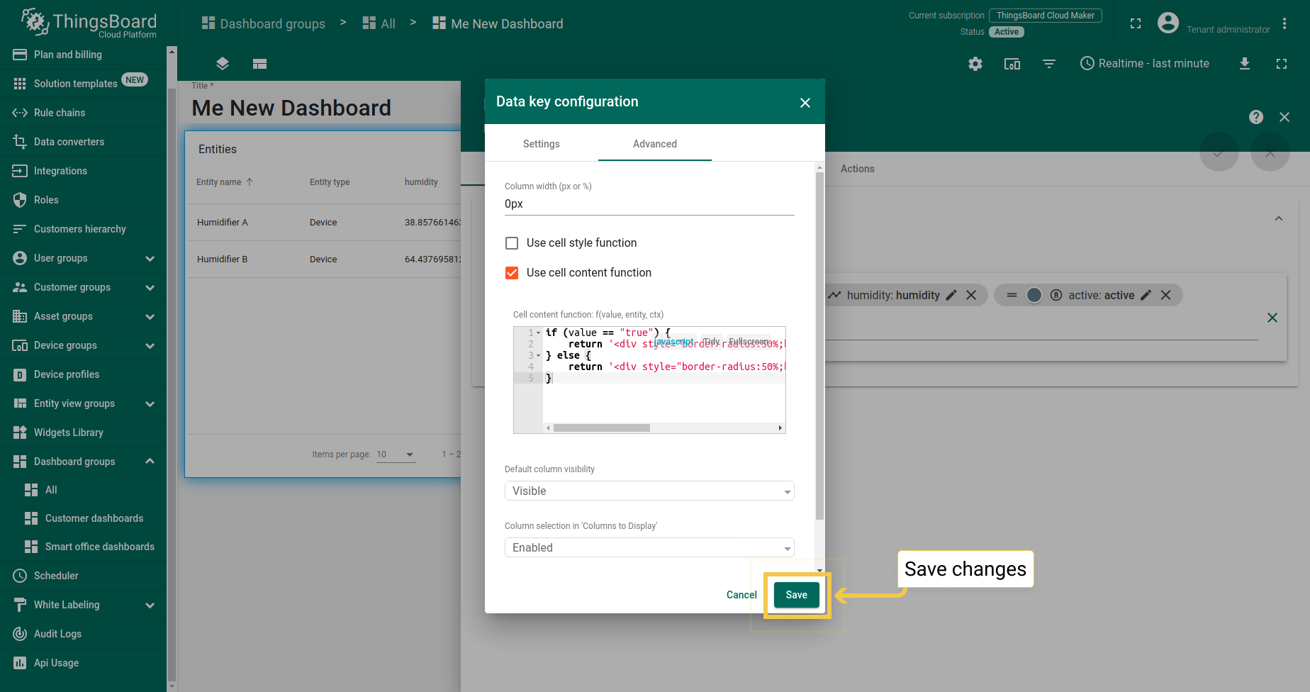
Cell content function allows changing the text of the data key column based on the value, entity, or ctx. The time series table widget from cards widget bundle also has a cell content function. To configure the cell style function, you should check the Use cell content function box and input the function in the field below. Then click the “Save” button in the lower right corner of the Data key configuration dialog. To apply changes, click the big orange checkmark in the upper right corner of the widget edit mode. To save applied changes, click the orange checkmark in the lower right corner of the dashboard edit mode.
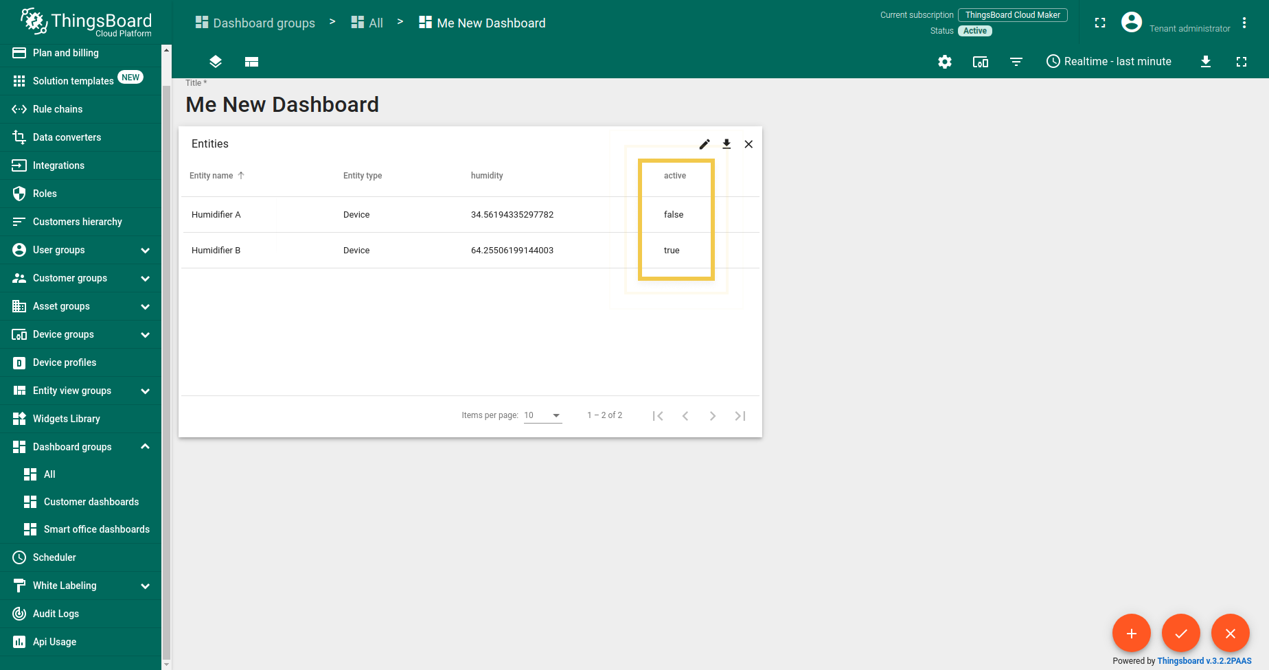
In the example, we have two possible device answers: true or false. Cell content function can change the answers text. It is acceptable when devices are not so many.


1
2
3
4
5
if (value == "true") {
    return "Active";
} else {
    return "Inactive";
}
However, there are times when it is not suitable to read the returning text to find out if a device is active or inactive. The cell content function allows configuring a more convenient way of displaying it by inputting a custom function to depicture an active/inactive status (see an example of a function below).
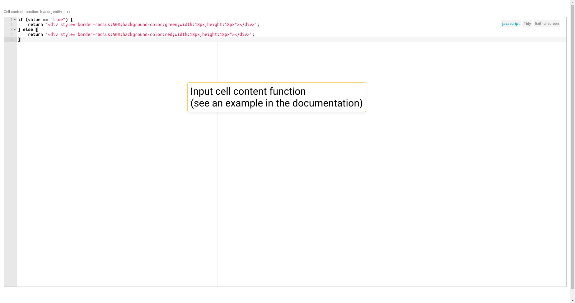
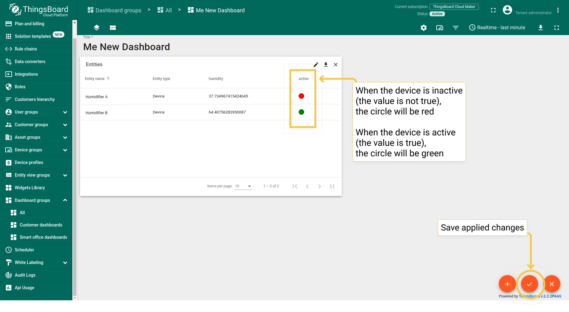
Configurable function to depicture an active/inactive status:
1
2
3
4
5
if (value == "true") {
    return '<div style="border-radius:50%;background-color:green;width:18px;height:18px"></div>';
} else {
    return '<div style="border-radius:50%;background-color:red;width:18px;height:18px"></div>';
}
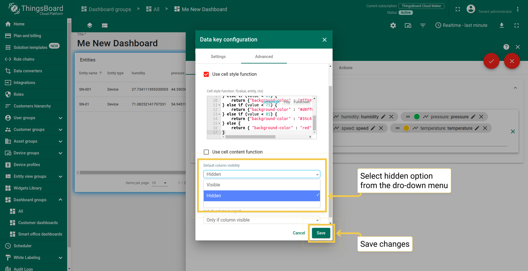
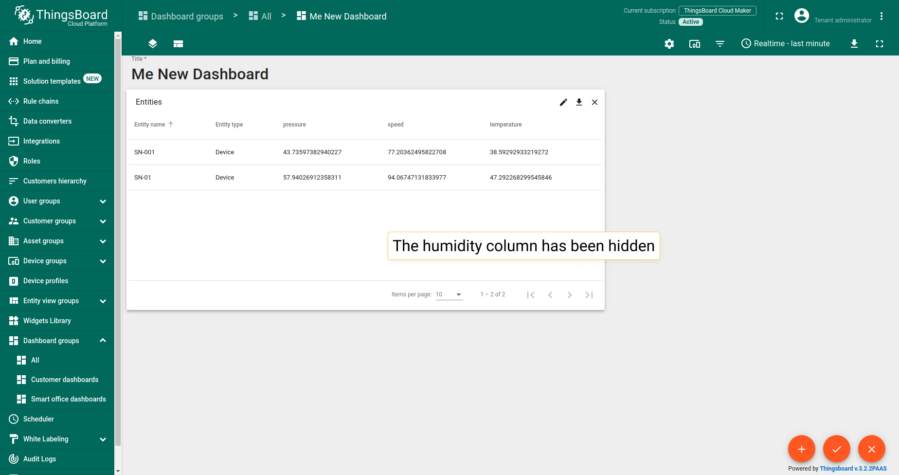
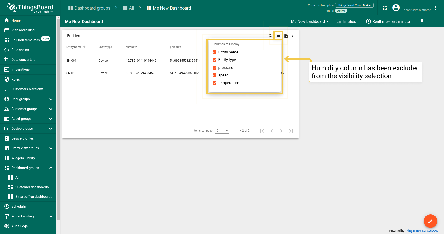
1.4. Default column visibility
Since 3.2.2, in the drop-down menu, you can select visible/hidden options to choose whether the data key column will be displayed in the widget. This is especially helpful during exporting a widget when you need to exclude a specific data key.
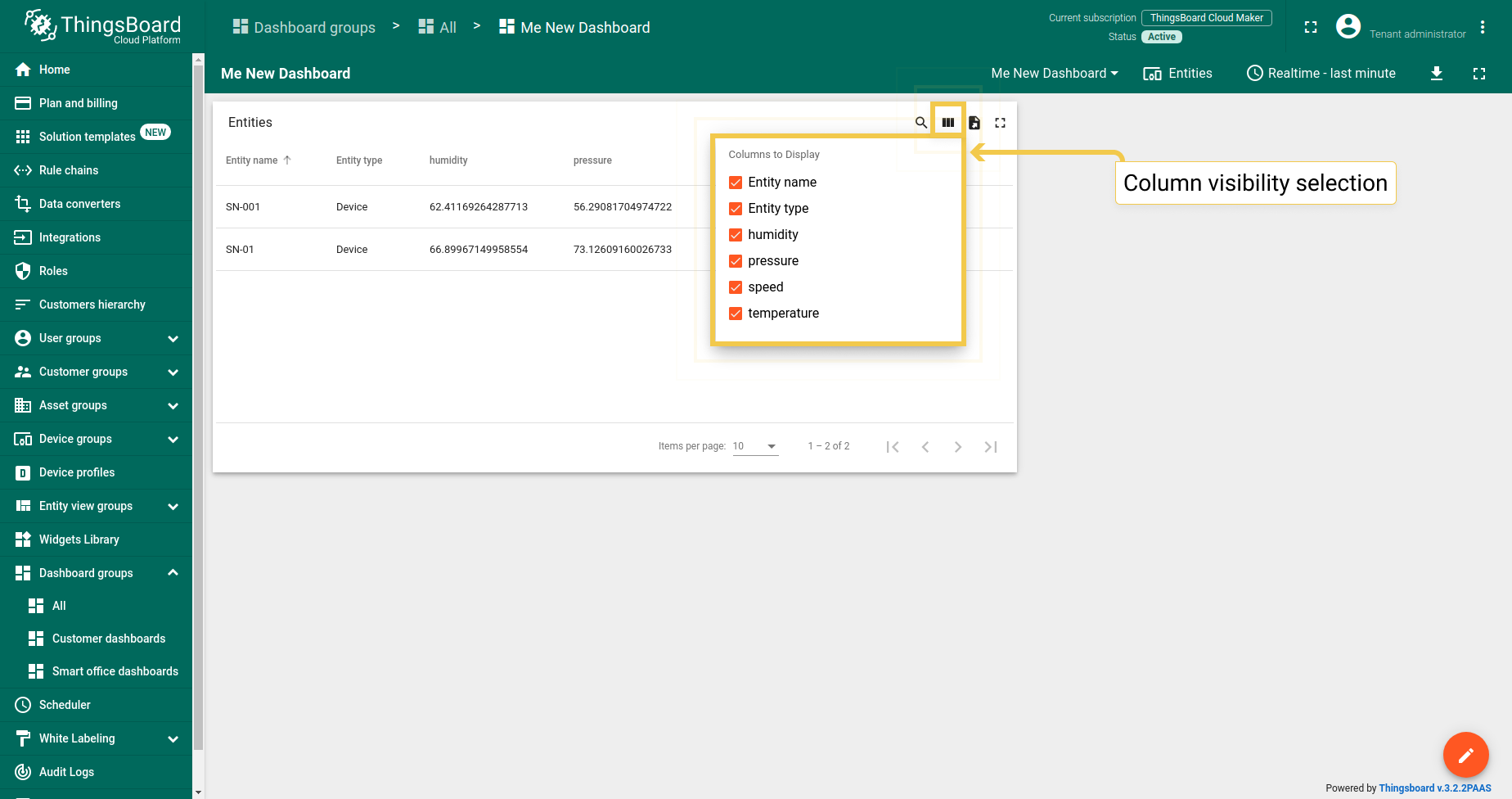
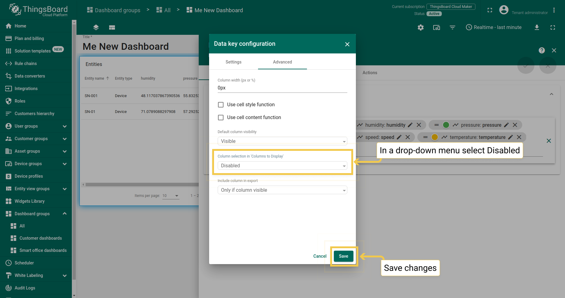
1.5. Column selection in ‘Column to display’
Since 3.2.2, in the drop-down menu, you can select whether the column will be shown in the visibility selection menu, therefore, clients without permissions will not be able to hide it.
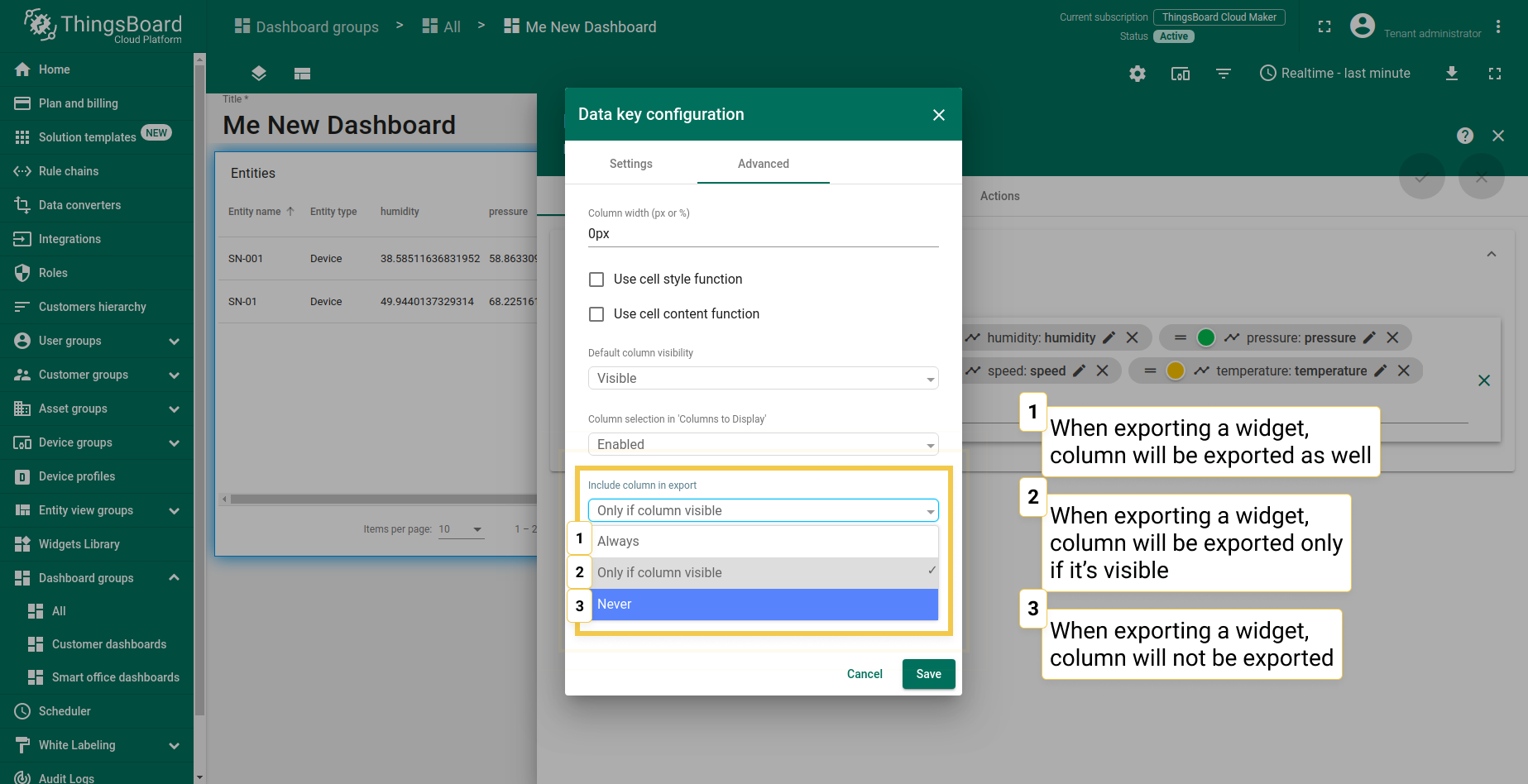
1.6. Include column in export
Since 3.2.2, you can choose under what conditions widget with a specific data key column can be exported. There are three options: always, only if column visible (you can change the visibility in default column visibility) and never. This feature is only available in the IoT Hub.
2. Charts
Coming soon…